Cheerios Packaging Redesign
Packaging Design, Graphic Design, Branding
Duration
1 Week
Type
Solo Project
Tools
the BRIEF
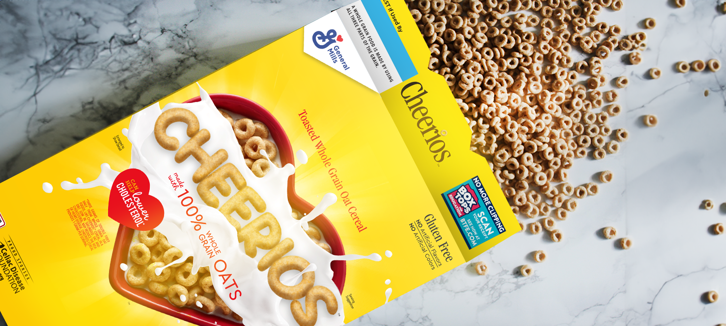
I set out to breathe new life into the iconic Cheerios cereal box packaging while preserving its brand identity. My goal was to modernize the design to be more dynamic and fun, in order to captivate both loyal customers and a younger demographic, ensuring Cheerios remains a beloved household staple for years to come.
#1
Selling Cereal in the United States
139.1
MILLION Boxes Sold Annually
$435.9
MILLION in Annual Sales

the PROCESS
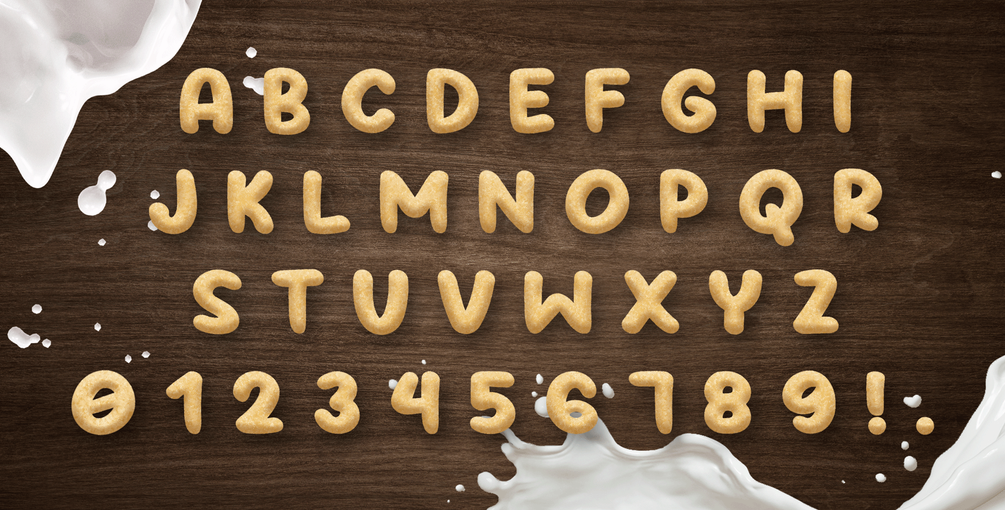
When I began brainstorming for this project, my mind instantly went to the idea of milk splashing. Nothing is more iconic in cereal commercials than the classic slow-motion milk pour – I wanted the new box design to capture this feeling. I also wanted the lettering on the box to capture the texture of Cheerios, as if it were actually made out of them.
Next, I dove into the history of Cheerios box designs. With such a classic cereal brand, I wanted to see what elements would be necessary to maintain the brand in a fresh way.
Looking at the history of it’s packaging design, it was clear that the main elements of the Cheerios box design was the classic yellow background, along with the name and a bowl of the product (typically with strawberries). In order to maintain recognition of Cheerios and appeal to loyal customers, I would need to include these in the updated design concept.
Cheerios Packaging Evolution
Custom Lettering
To make my idea become a reality, I created a custom lettering that looked like it was made of Cheerios. With the fast turnaround of this project, I decided to start with an existing font and modify the appearance of it. The Puffy Font was the perfect base for my Cheerios lettering – rounded and playful but still readable.


