Design System for Ally Bank
Design System, UI Design, Accessibility
Duration
2 Weeks
Type
Solo Project
Tools
the BRIEF
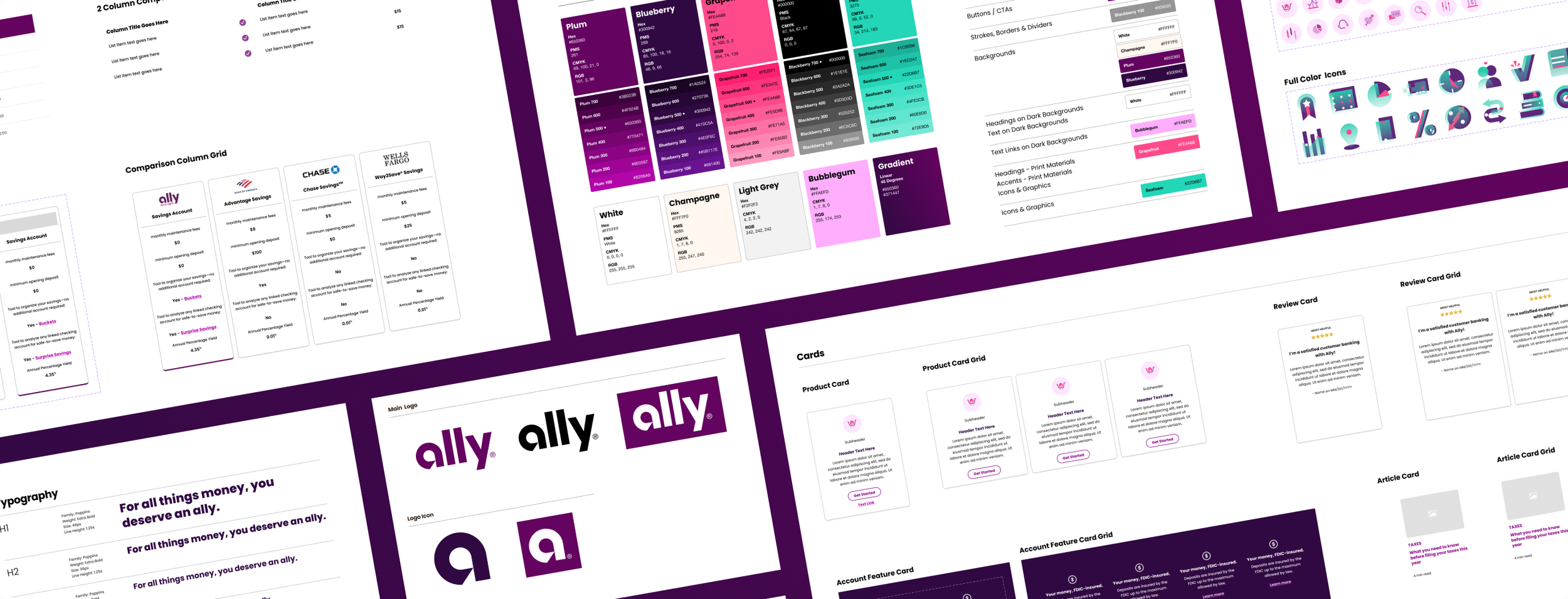
Design systems are crucial for keeping design elements consistent, improving efficiency, and ensuring that a brand's identity is preserved across platforms and designers. Creating a design system from scratch for an existing brand allowed me to practice my design skills and demonstrate my understanding of design principles and best practices. I decided to create a design system for Ally Bank because of their commitment for digital innovation and positive social impact, coupled with their website's variety of technical components. Ally's vibrant and friendly visual style offered the opportunity to work within a visually engaging brand, in addition to handling the technical aspects.

the PROCESS
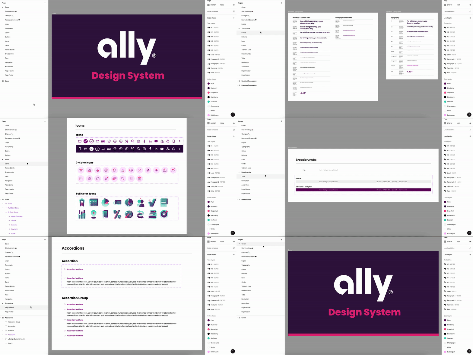
I began by doing an inventory of the Ally website, taking screenshots of key pages and identifying the elements to be recreated. Within Figma, I created a page for each type of element to keep the design system organized. Using the Inspect tool on Safari, I began to comb through the HTML source code. Beginning with the basic brand components, color and typography, I took note of all the styles appearing on the site.
I also contacted Ally’s Public Relations team inquiring about their brand guidelines for this student project. They shared a couple pages from their proprietary brand book, which included the official colors and typefaces. Cross-referencing the colors in the brand book with the web colors, I found that many of the colors used on the website did not match the official brand colors, including the color used on all buttons and links.
Original Colors
Updated Design System Colors
Refined to match official brand colors instead of having a separate palette
While inspecting the typography I found a wide range of text styles and sizes being used throughout the site. Nearly all of the headings and content titles were also classified as <H2>, which could lead to accessibility issues for users using screen readers and other assistive technologies. In my design system, I condensed the text styles into Headers 1-6, paragraphs, and a few additional classifications.
Original Typography
Inconsistent text styles across site, all headers H2
Updated Design System Typography
Streamlined styles and classified H 1-6 for improved accessibility
I continued to build the design system by inspecting specific elements like buttons and cards, and recreating them in Figma as dynamic components. There were 4 button styles being used throughout the Ally website, and only one appearance state for each button. I recreated these buttons and added additional button states (hover, pressed, etc.) to improve accessibility by providing clear visual cues and feedback for users.
Original Buttons
Expanded Button States
Creation of additional button states for improved accessibility and to provide clear visual cues and feedback to users
Through my exploration I found similar design patterns being used for cards across the site, but with slightly varying sizes and appearance. I condensed these elements into a single super component that can be quickly adjusted as needed.
Original Card Designs
Inconsistent icon size, text styles, spacing and shadows.
Updated Design System Component
Dynamic component allows for easy modification.

the OUTCOME
Design System Improvements:
Refine color palette to better suit brand guidelines and improve overall appearance.
Streamline typography styles for better consistency and accessibility.
Creating additional button states, enhancing accessibility by providing clear visual cues and feedback for users.
Streamlining card designs for style consistency.
Adjusting spacing of accordion text when opened to align with title.
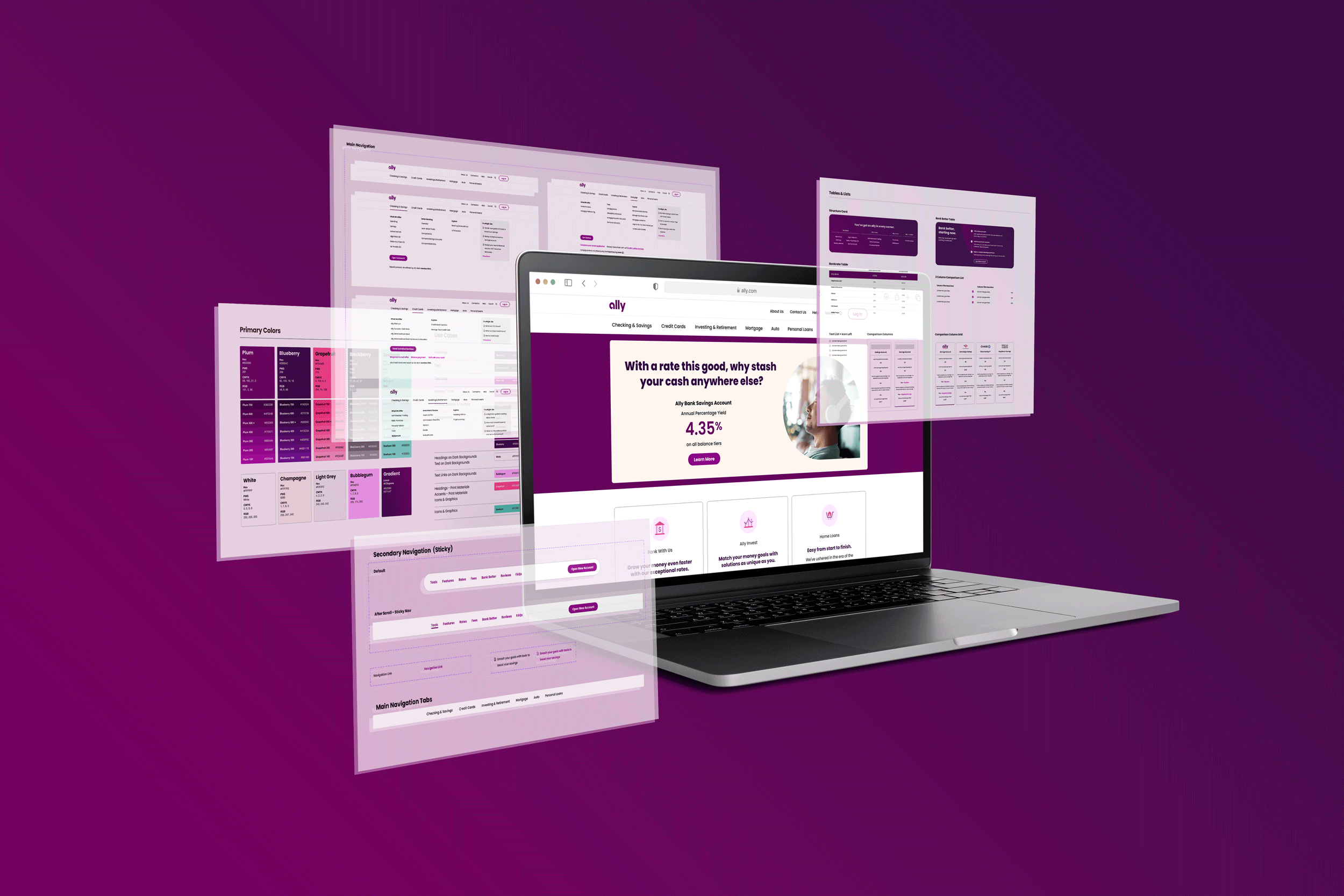
In order to test the functionality of this new design system and its components, I recreated three pages from the Ally website. The components not only made this process move very quickly, but resulted in pages that matched the existing website almost exactly (minus the noted improvements). These screens can be seen in closer detail in the design system Figma file, linked above.
the LESSON
By creating this design system for Ally Bank from scratch, I successfully established a cohesive visual language and standardized components that reflect the brand's vibrant and user-friendly identity. This project allowed me to expand my skills in Figma by leveraging dynamic components and auto layout to create adaptable design elements, and to better understand front-end development by exploring HTML structures on websites through the inspect tool.
I also gained valuable experience from working within an existing brand, spending time learning and understanding their identity in order to create a design system that suit it. This also proved to be an additional challenge when halfway through creating the design system, Ally began implementing new header styles, design elements, and navigation bars in select pages on their website, forcing me to be flexible, understand and adapt to the changes while staying on schedule with the project.


